

Project leadership, Experience design, Accessibility
2022-

44
modules
1812
pages
9
regional site
mtu - a sub-brand of Rolls-Royce - is a global manufacturer in various industries, for drive, propulsion and power generation. Serving governmental and business customers all around the world.
With global collaboration and numerous stakeholders, the design and development process was time-consuming and siloed, requiring frequent meetings.
Requests mainly came top-down from stakeholders or from the development team, with few bottom-up proposals.
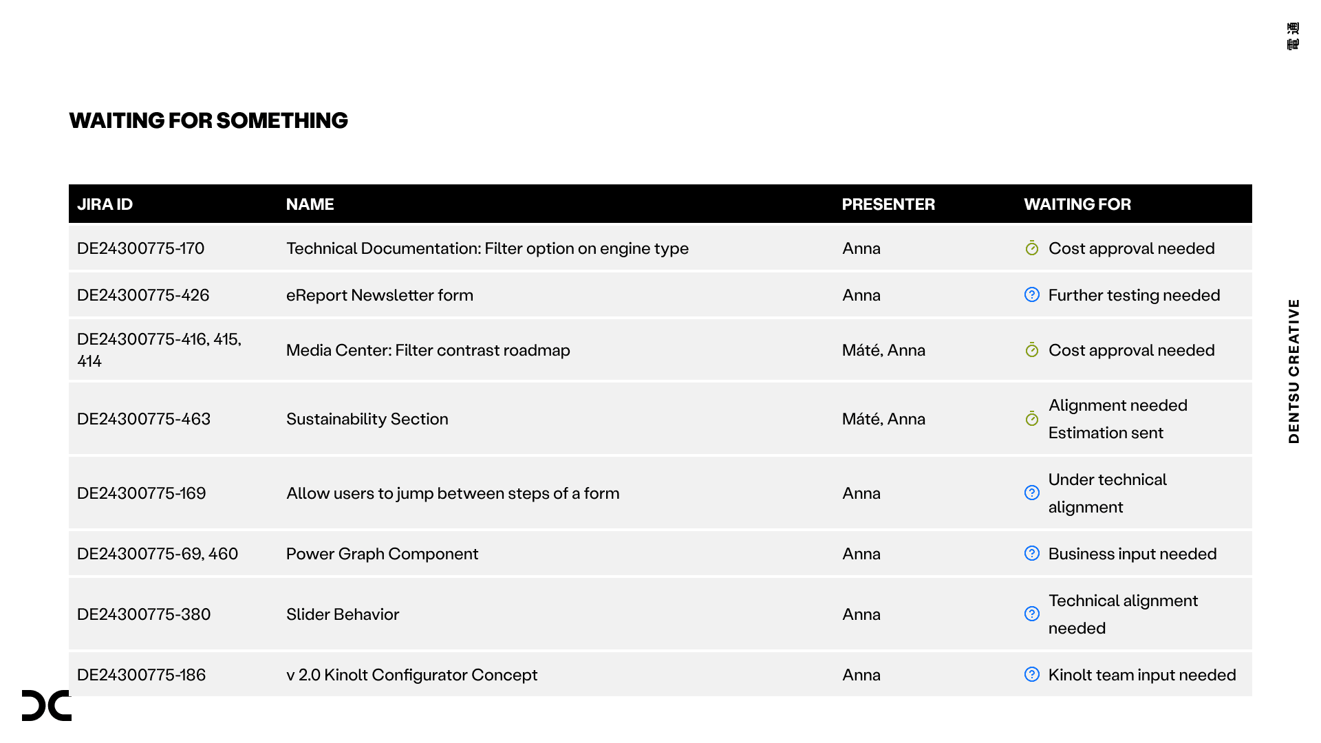
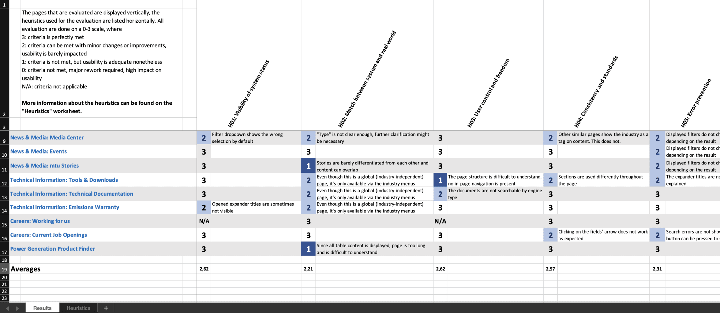
When I took over the project, a mid-level UX designer had completed a heuristic analysis, identifying nearly 40 usability issues across the website. Issues needed to prioritised, estimated, resolved, approved by the client, and then handed to UI, or development.
This was extensive to manage.
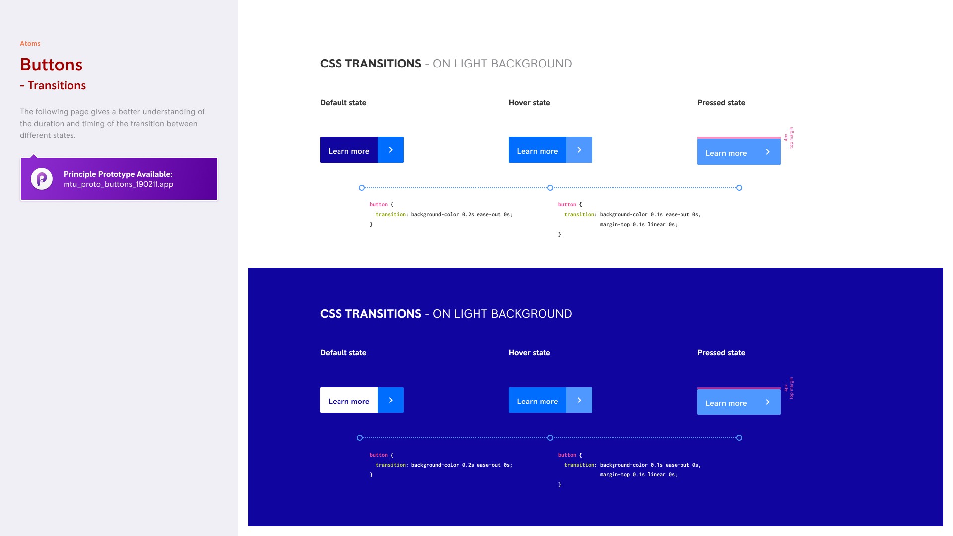
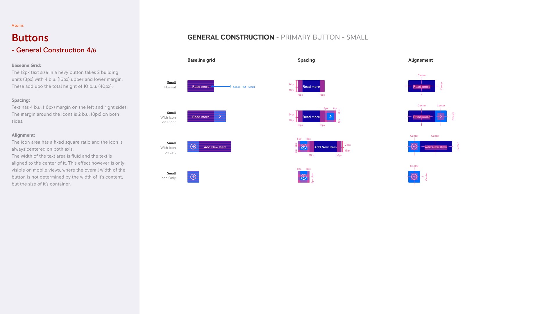
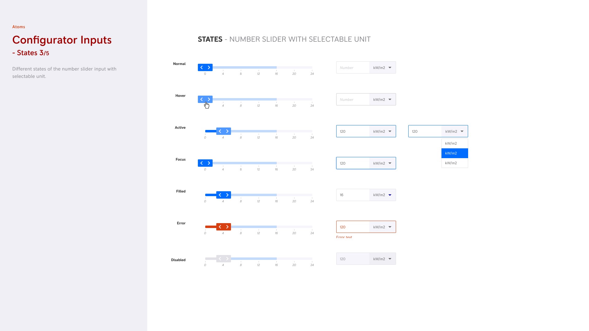
We had an atomic design system with documentation for five breakpoints to streamline collaboration with our German development team. This needed to be updated each time, when a new module was developed.
As Figma's capabilities evolved (auto-layout), it became time-consuming to use the system in it’s original form, highlighting the need for modernisation.
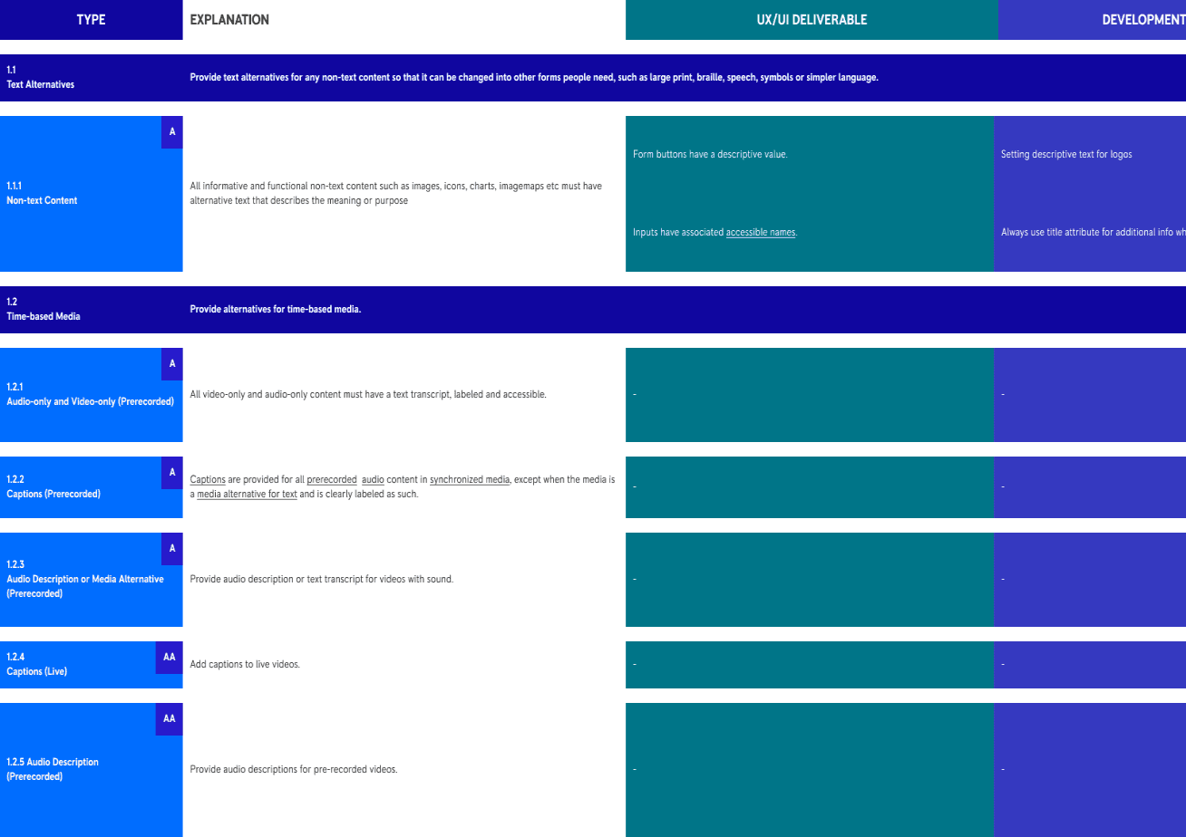
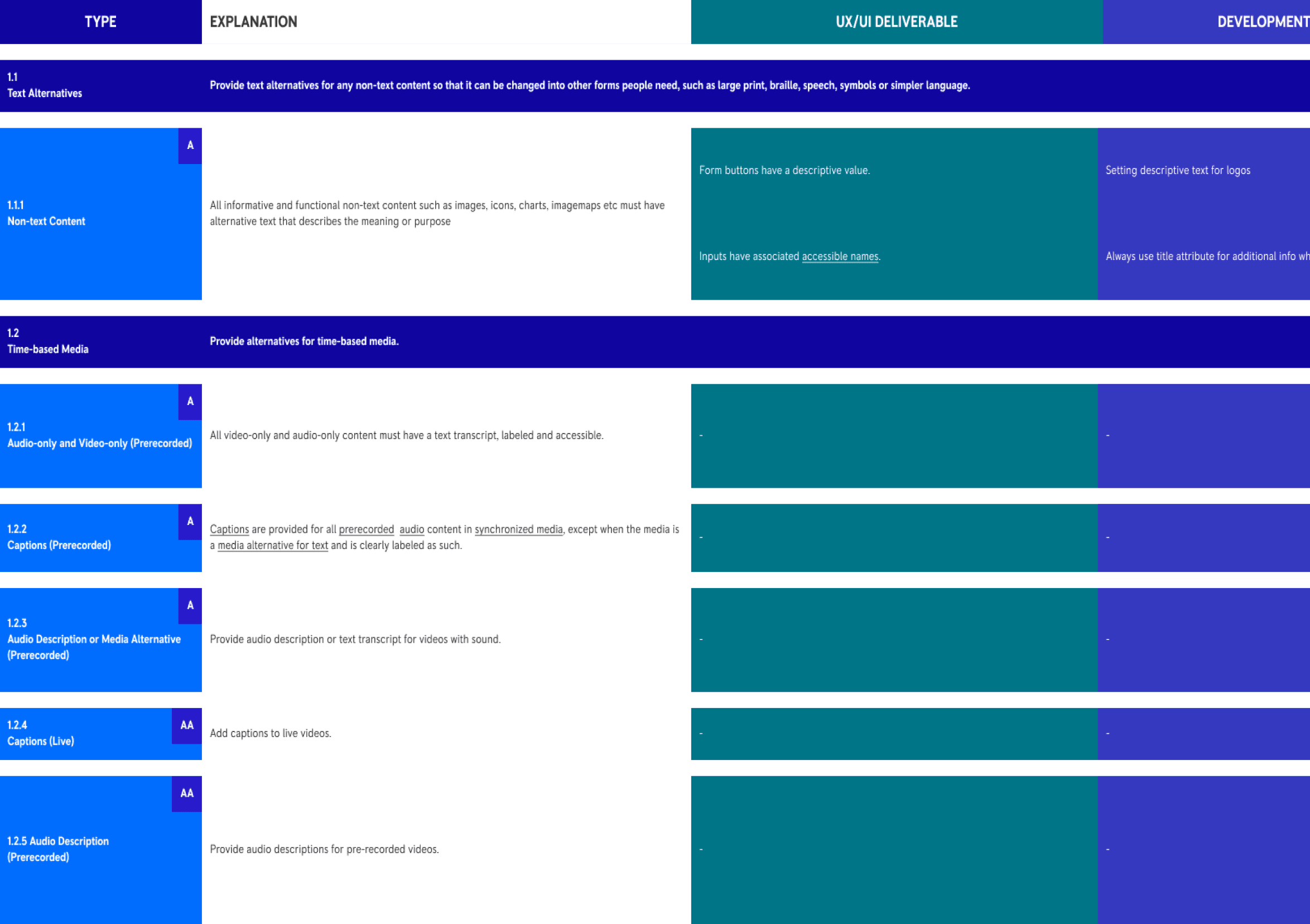
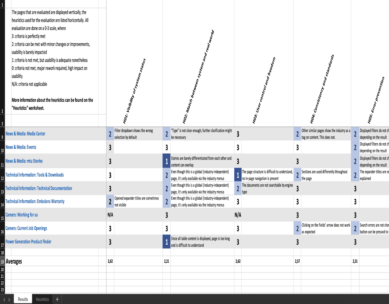
Part of the matrix on the WCAG 2.2 criteria, that we created with the Principal UI designer. Allocating tasks for development, design, and content.
Designs should be inclusive of users of all abilities.
This was my first project with a focus on accessibility.
We improved project collaboration: We emphasised a close dev-design partnership, joint planning, and regular discovery phases.
By departing UX and UI tasks, I could focus more effectively on UX.
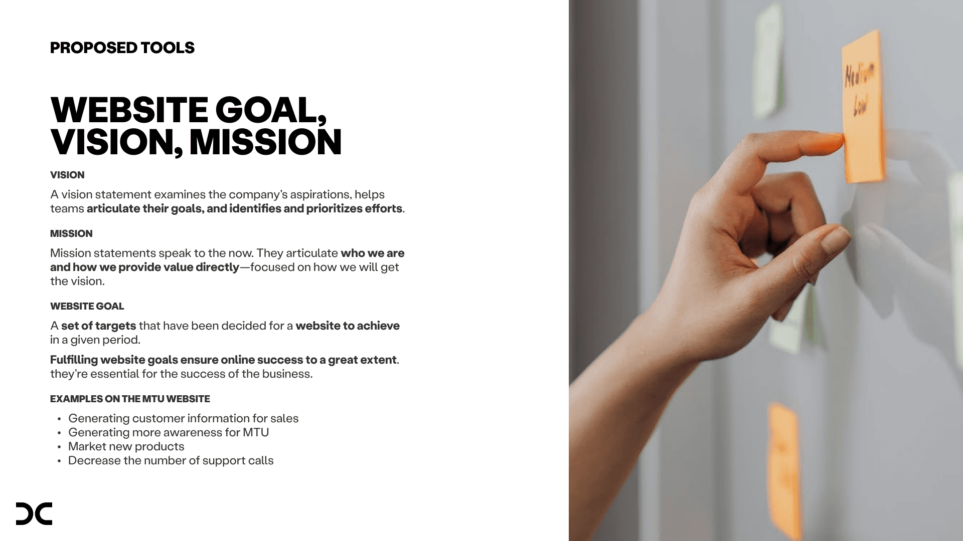
To ensure alignment, I gathered insights on the website’s vision, mission, business goals, and target audiences, leading to stronger designs.
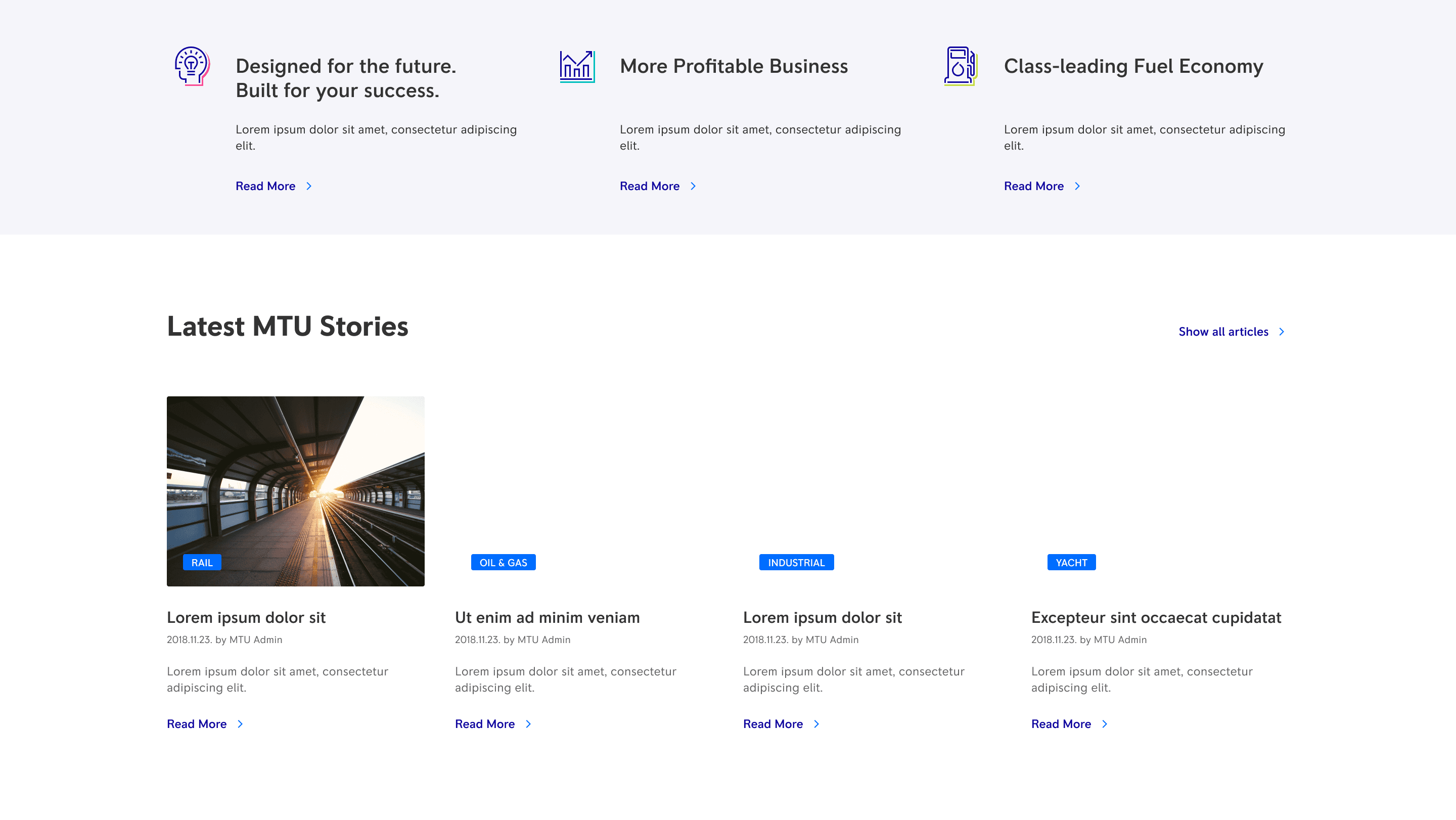
We applied a modular approach to UI design: pages could be easily set up and arrange. Atomic design principle kept our designs consistent.
When creating new modules, with providing foundational design guidelines and detailed descriptions of UI elements, we ensured alignment throughout the entire development phase.


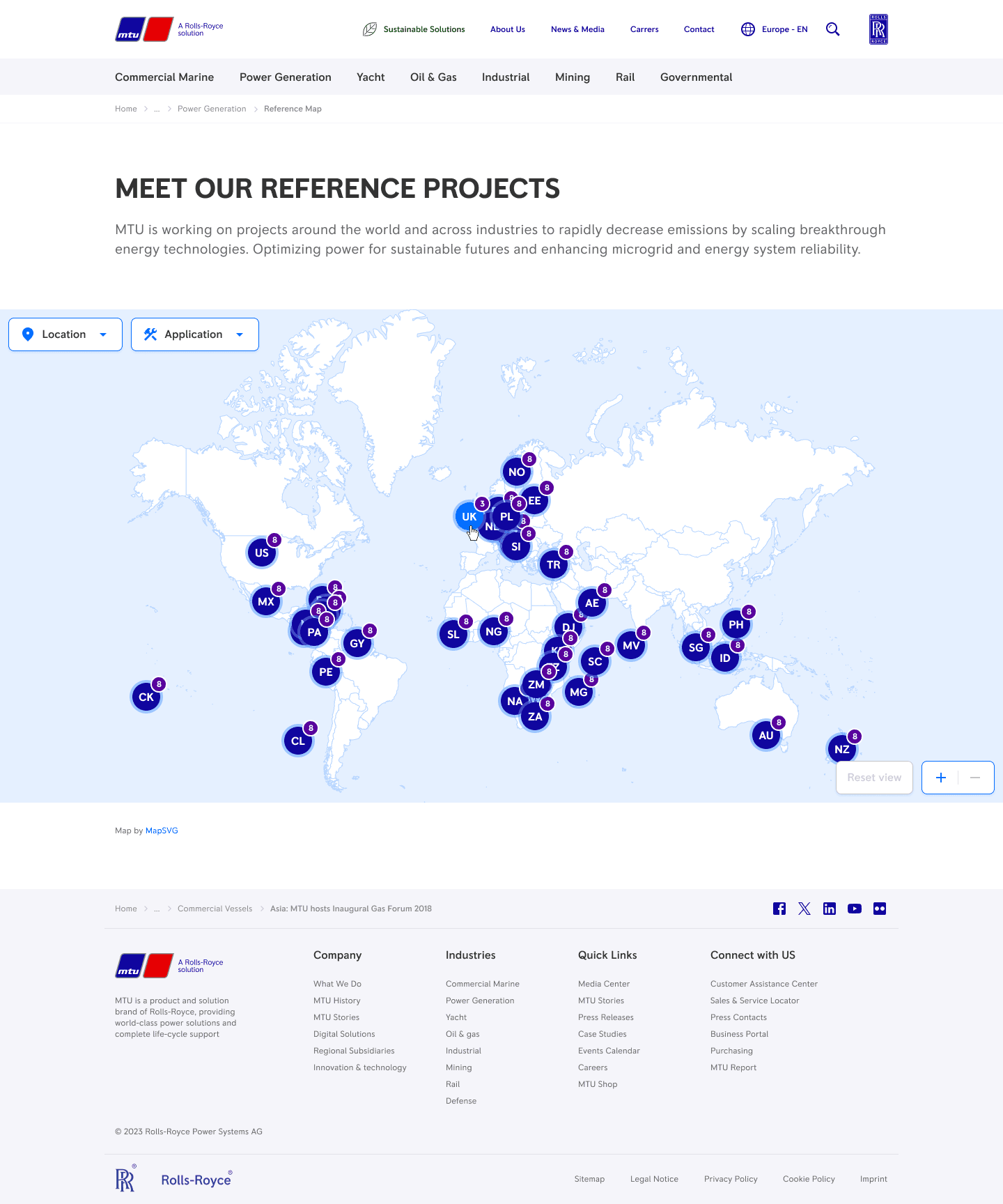
One of our last collaboration: a sales tool to showcase flagship facilities
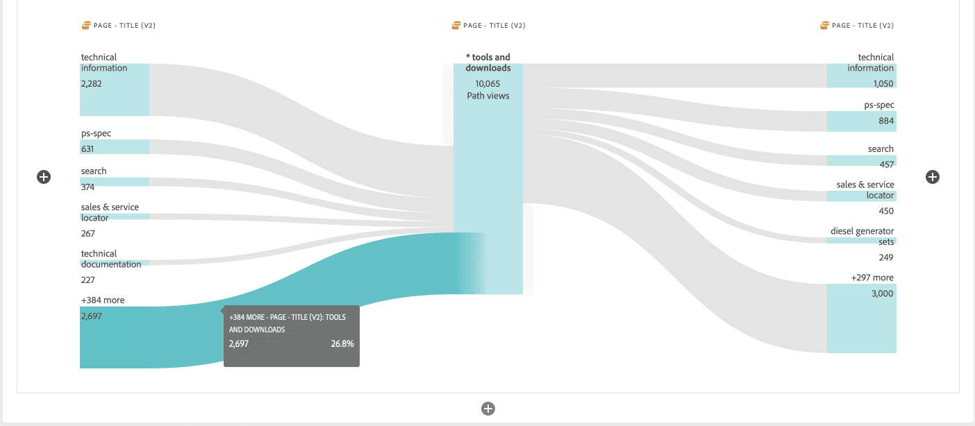
A beautiful flow, and insight on visitor activity data provided by one of our analysts
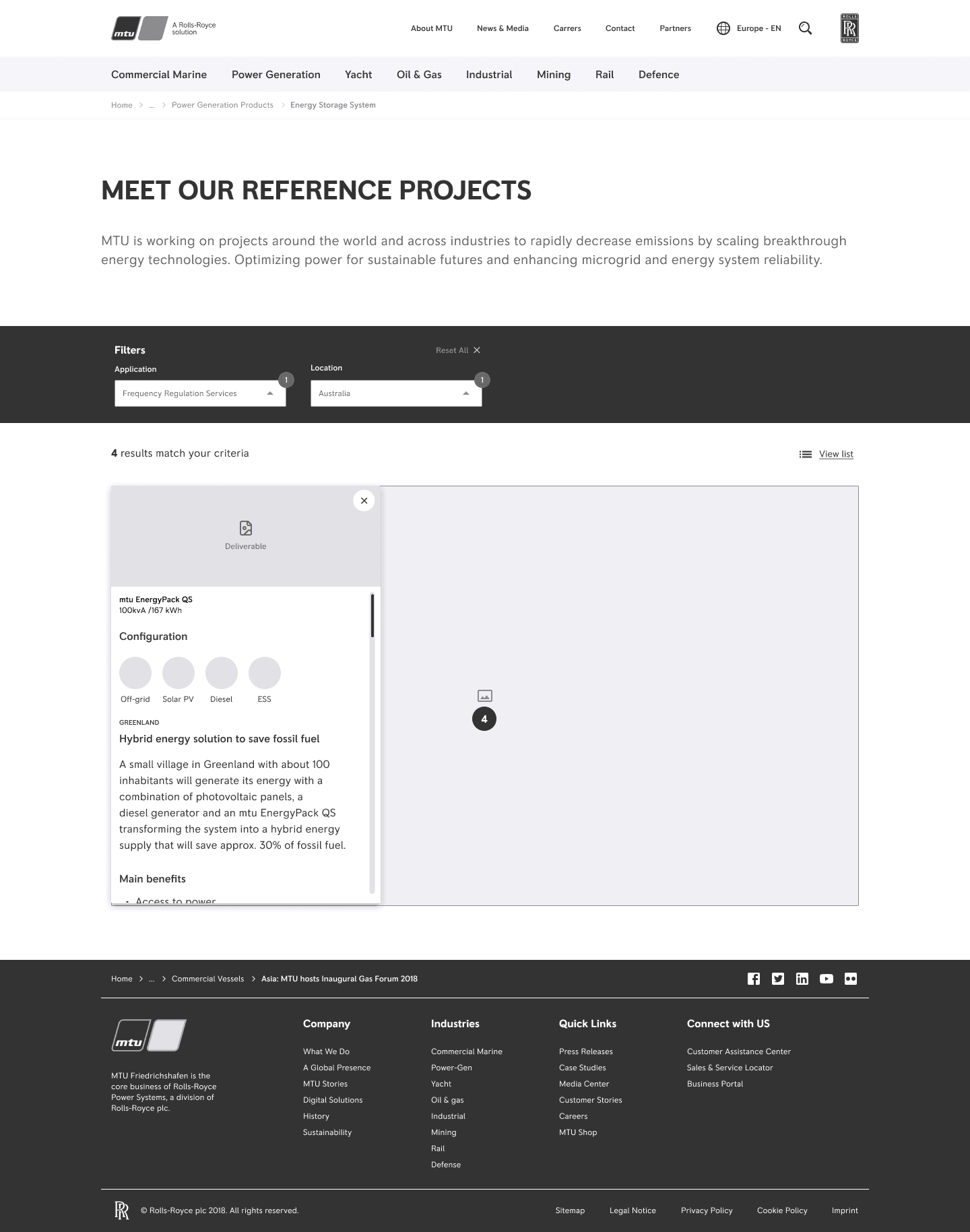
I created wireframes to assess viability and feasibility of the modules with our client and dev team for each project. Based on feedback, I refined these, and the accepted wireframes formed the foundation for UI and development estimation.
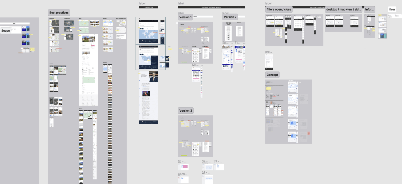
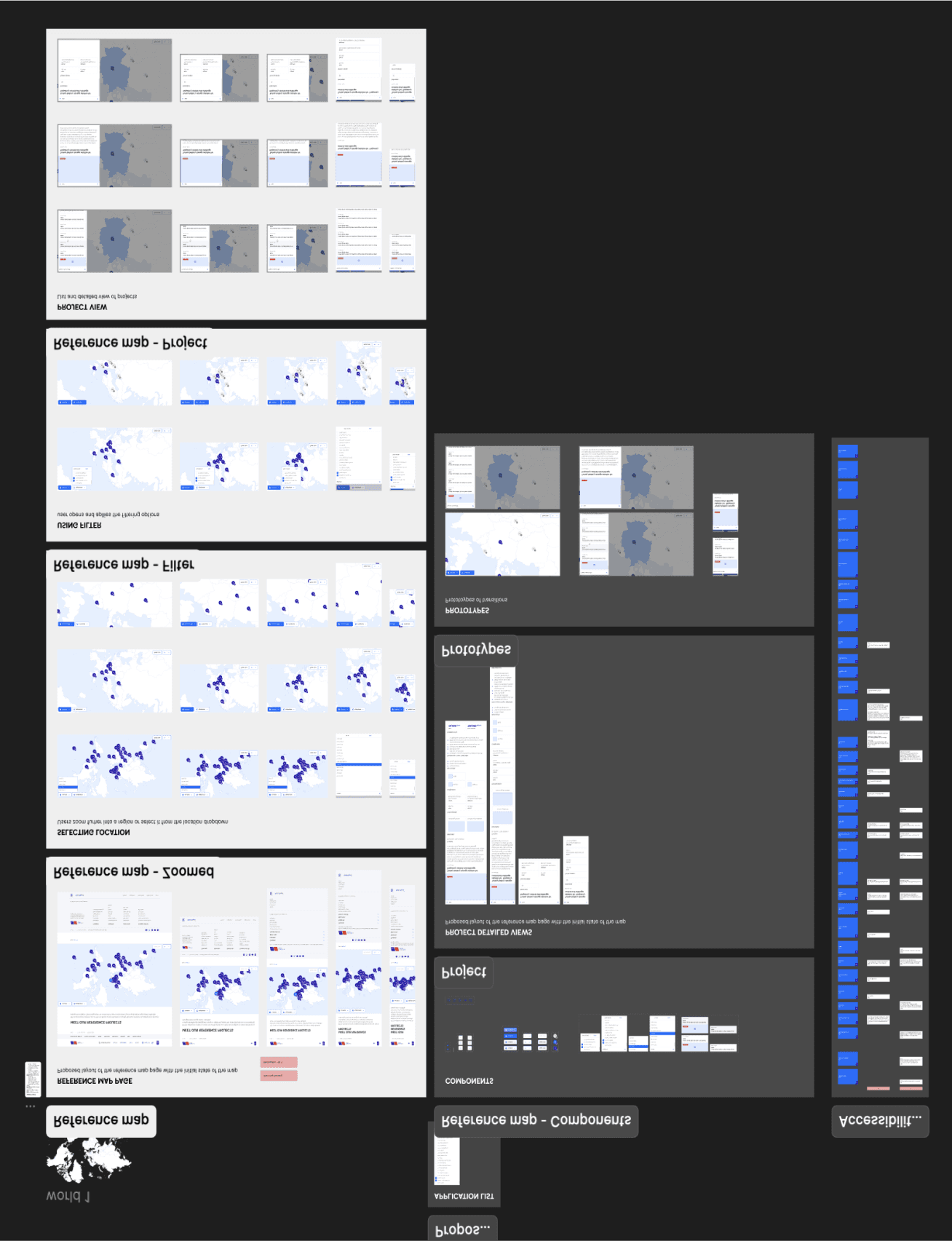
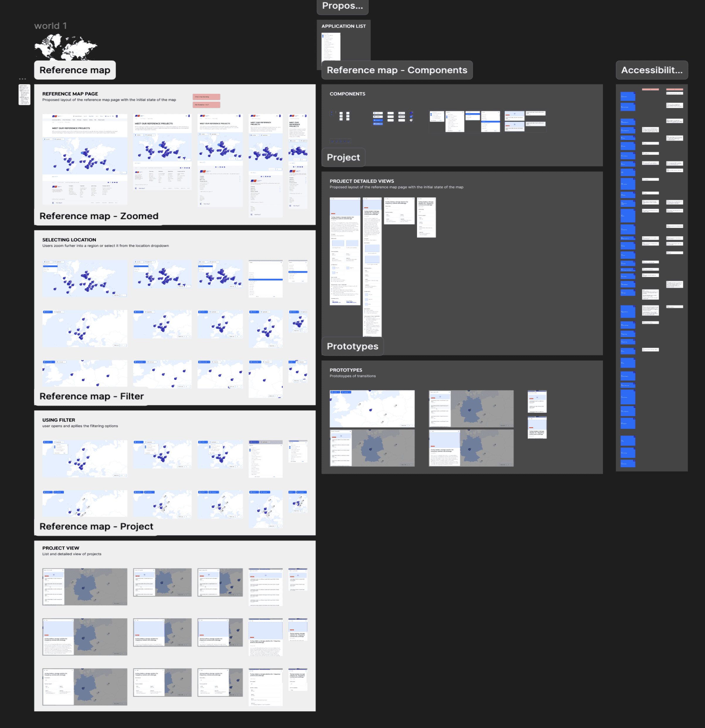
A sneak peek into our Figma file: My discovery and wireframe versions, alongside the systematic, pixel-perfect UI designs and accessibility inputs for the developers
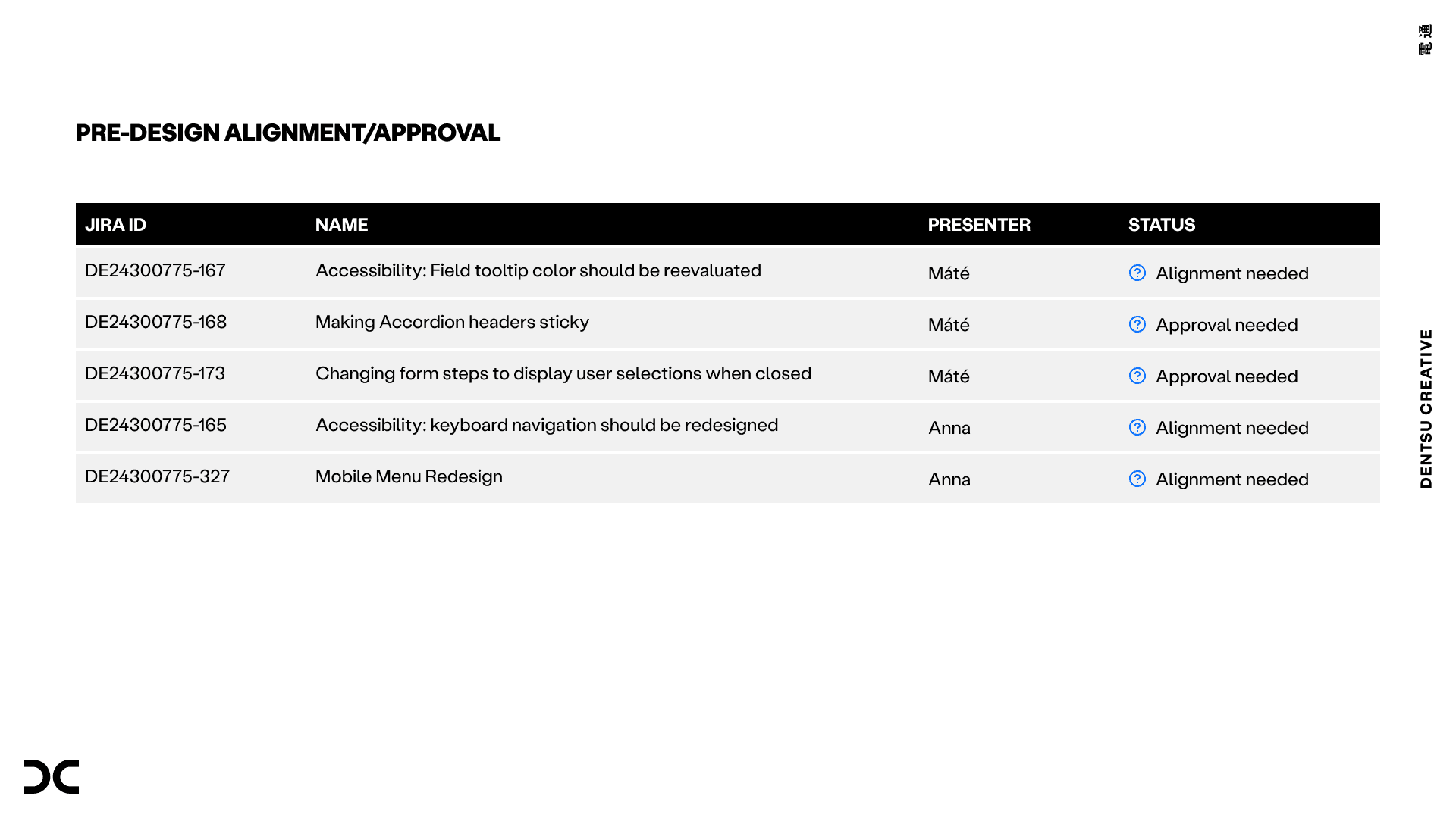
I proposed a roadmap to streamline tasks, timelines, and project boundaries and set up a Jira board to track our progress.
To allow more focus on UX and collaboration, I recommended hiring a project manager to handle operational tasks—two months later, we welcomed one on board!
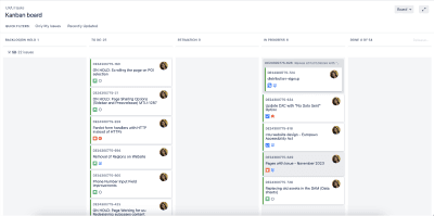
The UX/UI Kanban board I set up in Jira is still up and running 🏃🏻♀️
Summary
We shortened project timelines with a new workflow. Introduced evidence-based designs and wireframes to improve estimations and decision-making, while providing the development team UX/UI support and accessibility guidance.
My role
Project results
Dentsu HU
Dorottya Hatscher, Site-build
Máté Tóth, Principal UI Designer
Anna Vásárhelyi, Senior UX Designer, Project Lead
Merkle DACH
Birgit Beecker
Christin Co
Xavier Taylor
mtu
Yvonne Schölzel
Thomas Hauptle
Pete Knoop